Now, you might have noticed that the Okto Bottomsheet looks the same for any app, regardless of its design. What if we told you there was a way to theme the bottom sheet to fit your app's design?
Customizing the Bottom Sheet
In you App.tsx file, we will use the setTheme method to customize the bottom sheet. This method should be ideally called at the root of your app. Here are some of parameters that you can customize:
textPrimaryColor(optional) - Text primary color of the theme.textSecondaryColor(optional) - Text secondary color of the theme.textTertiaryColor(optional) - Text tertiary color of the theme.accentColor(optional) - Accent color of the theme.accent2Color(optional) - Accent2 color of the theme.strokBorderColor(optional) - Stroke border color of the theme.strokDividerColor(optional) - Stroke divider color of the theme.surfaceColor(optional) - Surface color of the theme.backgroundColor(optional) - Background color of the theme.
App.tsx
import { useOkto, type OktoContextType } from "okto-sdk-react-native";

const { setTheme, getTheme } = useOkto() as OktoContextType;
// Just as an example, we are setting the backgroundColor to black
setTheme({
  textPrimaryColor: "0xFFFFFFFF",
  textSecondaryColor: "0xFFFFFFFF",
  textTertiaryColor: "0xFFFFFFFF",
  accentColor: "0x80433454",
  accent2Color: "0x80905BF5",
  strokBorderColor: "0xFFACACAB",
  strokDividerColor: "0x4DA8A8A8",
  surfaceColor: "0xFF1F0A2F",
  backgroundColor: "0xFF000000",
});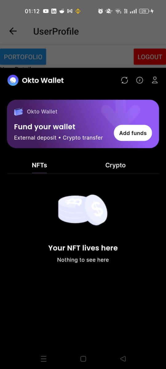
And that's it! It's as simple as that. Now, when you pull up the bottom sheet, it will be themed according to your app's design.